
De Verbinding Tussen Het Evangelie & Missiewerk


Recente projecten
Actuele ontwikkelingen van TGTM
Prophetic release
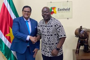
Een moment in de geschiedenis van Suriname werd gedefinieerd toen een speciale delegatie waaronder Apostel Michael Maijnard het kabinet van de president binnenstapte. Deze ontmoeting was niet zomaar een beleefdheidsbezoek. Integendeel, het droeg een gewicht van goddelijke bedoeling en diepgaande geestelijke betekenis.
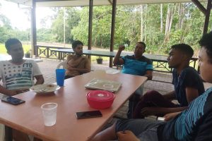
Jongeren van TGTM-NL op Zendingsreis met Apostel Michael
Terwijl de wereld zich blijft bewegen in een constant veranderende dynamiek, zijn er jongeren die een roeping volgen die ouder is dan de tijd zelf – de roeping van discipelschap. Onder de leiding van Apostel Michael zijn jonge discipelen van TGTM-NL op een bijzondere zendingsreis gegaan in Suriname, klaar om de wereld te dienen en te veranderen. Lees verder

In een wereld waar de druk op mannen vaak overweldigend
is, bood de mannenretraite een heilige ruimte voor reflectie,
heling en groei. De mannenretraite was een transformerende ervaring.
Mannen kregen de kans om de diepten van hun ziel te verkennen, oude
wonden te genezen en zich opnieuw te verbinden met hun
authentieke zelf en het vaderhart van God. Lees verder
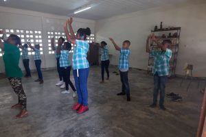
Het scholenproject gebruikte dans (DWDM) als een krachtig medium
om jonge mensen hun ware identiteit (TGTM) te laten
herontdekken. Door dit initiatief voelden studenten een
honger naar Gods onvoorwaardelijke liefde en werden ze
gestimuleerd om hun verborgen talenten te verkennen en te gebruiken voor een hoger doel. Lees verder
Onze sponsoren
Reactie sponsor...

Reactie sponsor...